Newcastle City’s Net Zero Action Plan
OVERVIEW
Project Brief
Newcastle is aiming to become carbon neutral by 2030, this means that they will have a balance between emitting carbon and absorbing carbon. Our task was to present an idea back to Newcastle city council that they could use to help the city to reduce carbon emissions.
The Goal
To create and design a product/service that will help Newcastle reduce its carbon output so it can become carbon neutral by 2030. Our goal as a group was to create a gamified recycling competition in Newcastle to help reduce the carbon emissions from rubbish.
Tools
Adobe Illustrator, Adobe Photoshop, Adobe AfterEffects, Miro, Sketch, Figma
View my full design process: EKO Design Document
Research
Ethnography
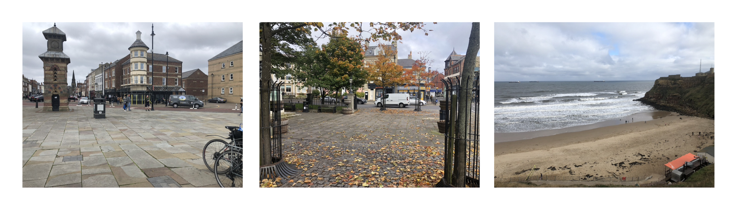
We started off our project by conducting some research. As we had chosen our potential location (Tynemouth) we went on to conduct some Ethnography research to capture the feel of the area and understand more about the people who visit to help us form our concept going forward.
Some important information that we gathered while conducting this ethnography:
Before 10 am it was mainly locals walking or biking in.
Not many people wanted to go to cafés - they looked as if they were just trying to get to the beachfront.
As the weather got better throughout the day more and more people started to show up such as a few joggers.
This form of research was really useful in helping us decide where we could have an exibition/product/service if we were to chose Tynemouth as a location.
Interviews
As well as our Ethnography, two group members conducted interviews - one conducted an interview with someone who is a resident of Tynemouth, and one conducted an interview with a visitor of Tynemouth. The interview transcript can be found on the full document link (at the top of this page).
Personas and Scenarios
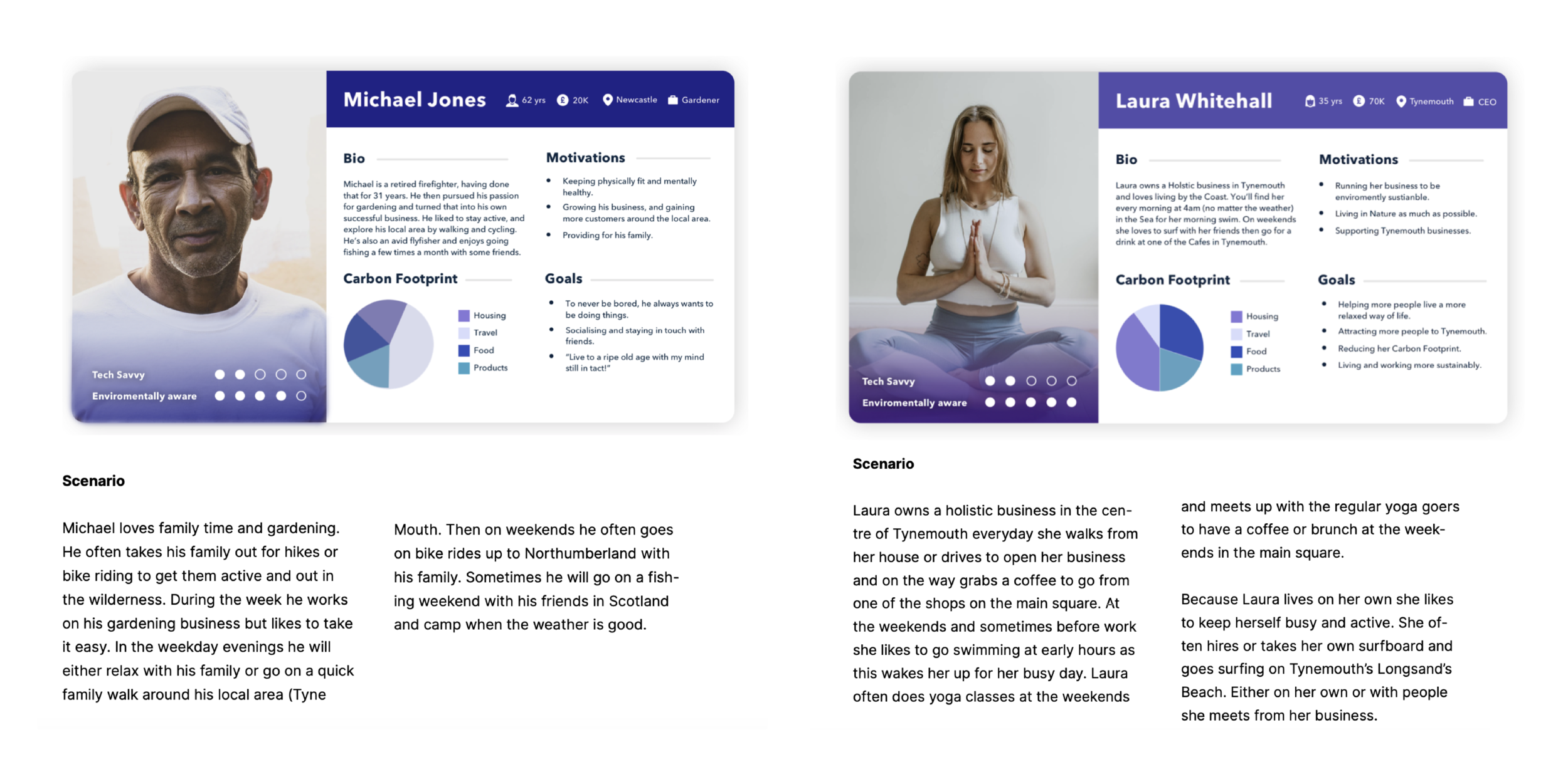
Based on our Ethnography research as well as the interviews we carried out, we created three personas. We also created three scenarios for these personas, putting them in our chosen location (Tynemouth). You can see two examples below.
Primary Survey Research
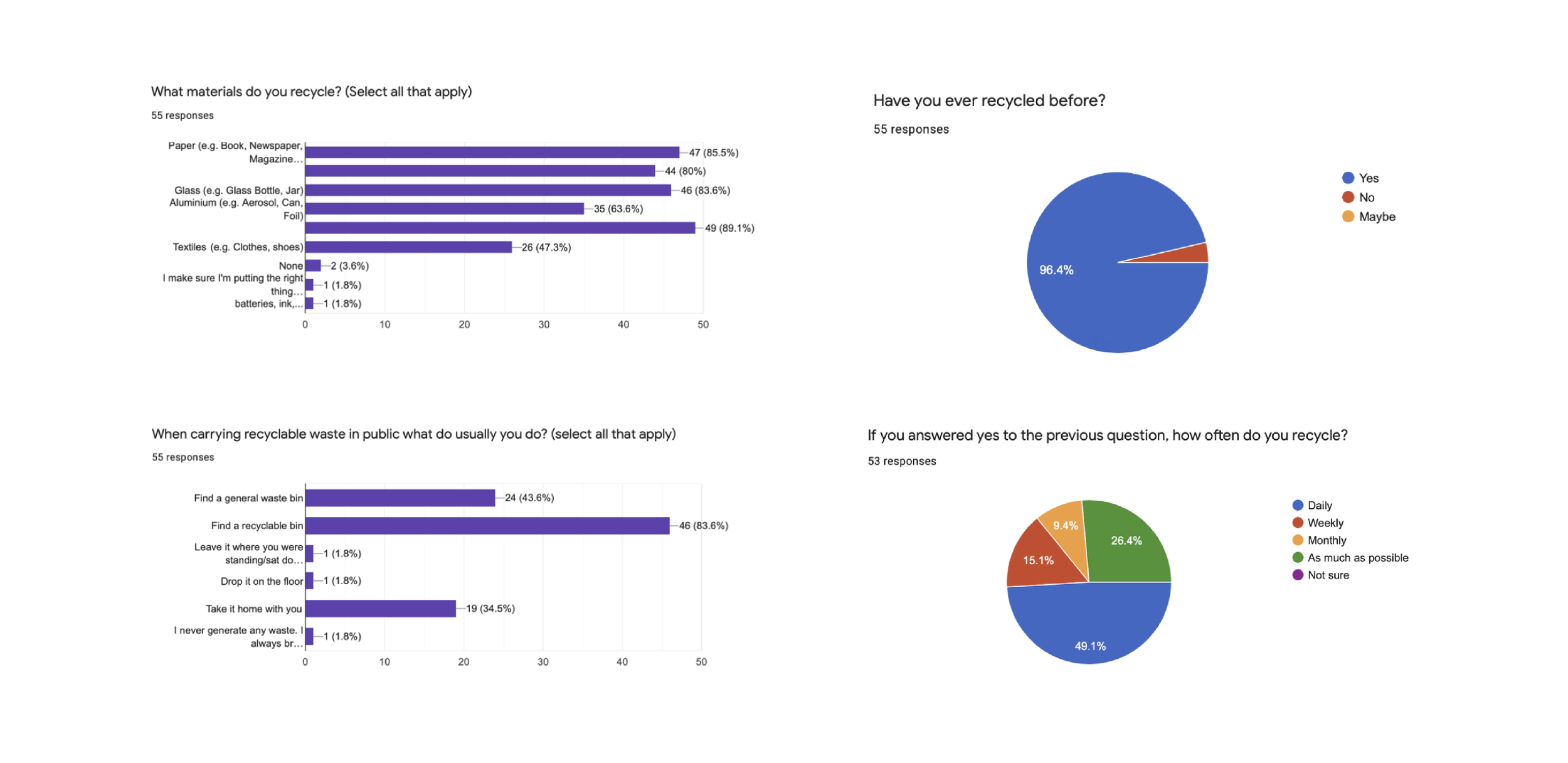
At this stage we knew that our concept was going to be around encouraging recycling, so we wanted to start collecting some feedback from our potential users. We all agreed that the best way to do this was through a survey that asked specific questions around our idea as well as general recycling questions.
The main areas we wanted to discover were: if they recycle, what they recycle, their behaviours with rubbish when out in public and what would motivate them. We found that the best way to motivate them to recycle more would be an intrinsic reward (feeling of satisfaction). Below are some of the survey findings that we have gathered.
Survey Affinity Map
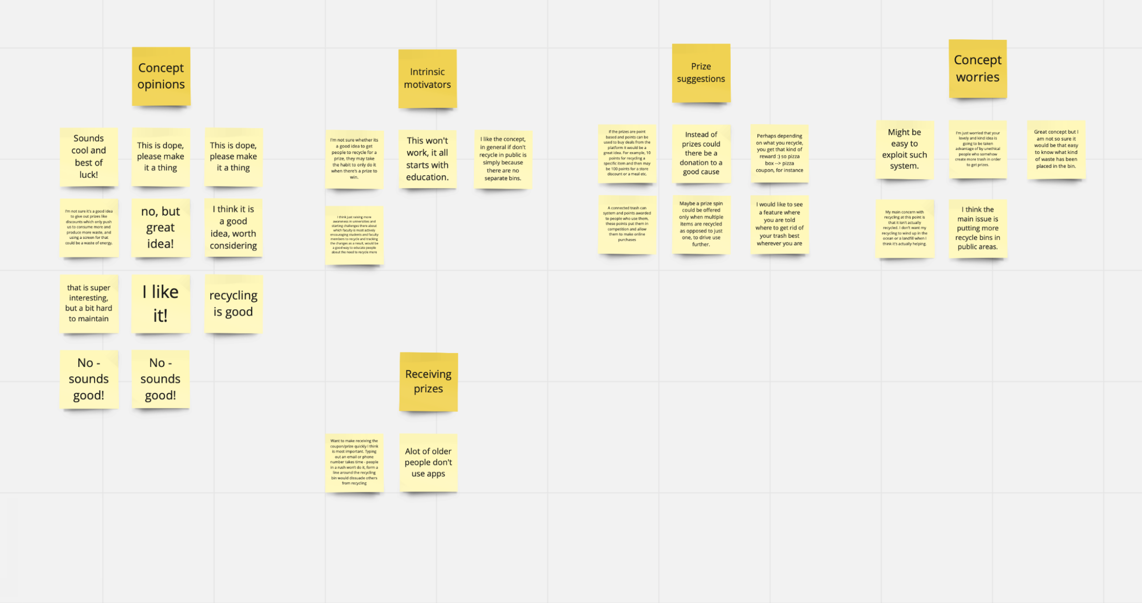
After gathering all of our survey results, we decided to create an affinity map where we organised our results (qualitative) into sections to give us a high-level overview of all our responses.
You can see an image of our affinity map to the right however some of the text on the post-it notes may be hard to read. To view the Miro board with our affinity map on, follow this link.
Ideation
Finalised Concept Sketches
Based on all of the research we conducted, our final concept is a community based competitive recycling scheme. This would put 2 similar communities in competition with each other to reach a set recycling target. We thought it would be good to include a target so the communities know that there is a target to reach (something to strive towards).
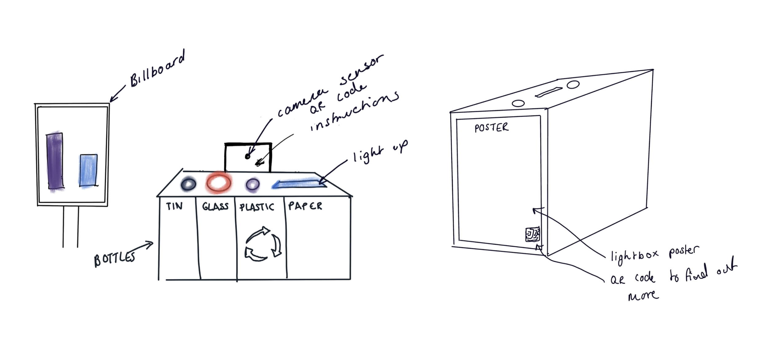
The bins located in each area would be able to measure when rubbish is placed into the bin and display it visually on interactive posters. We were thinking the bin and interactive poster in each area could be next to each other, to show that the two link together and are part of the same scheme. Below are some example of the original bin and poster concept sketches.
Design
Brand colour scheme
Our colour scheme is quite bright and eye-catching but at the same time, all of the colours really fit together well. The whole purpose of our concept is to gamify/encourage the idea of recycling, this means that the branding needs to be fun and inviting rather than the usual branding of recycling which seems quite dull and serious.

Brand name and logo
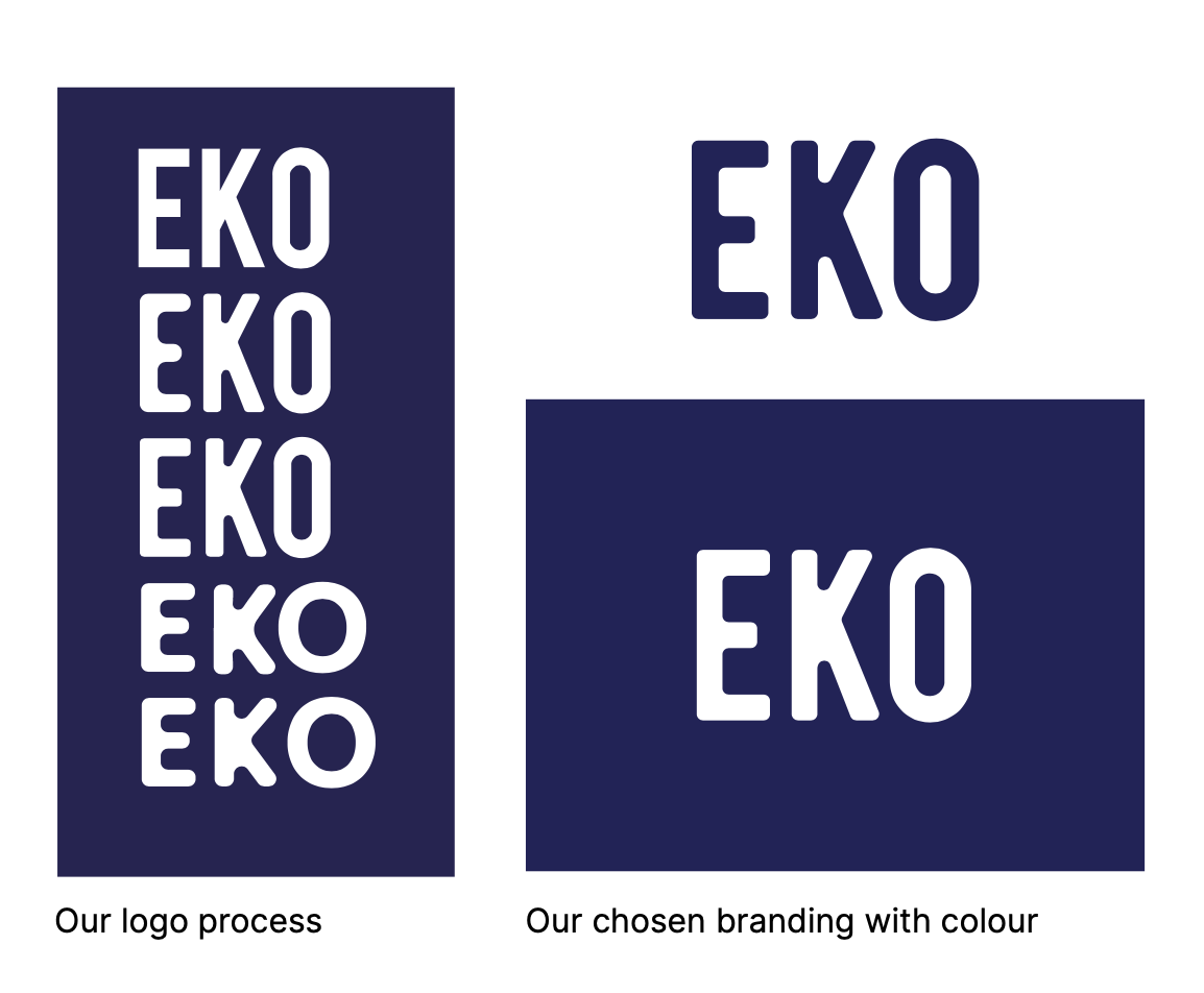
We ended up choosing the name ‘EKO’ because of its environmental meaning, we feel that this combined with our futuristic branding would portray the brand exactly how we envision it.
For the branding of our EKO scheme, we decided we wanted a strong bold font that would be easily visible on the bin. Initially, we looked into various fonts with the chosen colour scheme. However, the fonts we looked into were quite harsh. They didn’t fit the schemes brand which is a friendly competition they looked too serious.
Then we began to develop the fonts by adding the curvature on each letter to give the typefaces a bit more personality and to make them appear more fun. The final font we decided to go for was Bebas.
Interactive Poster Design concepts
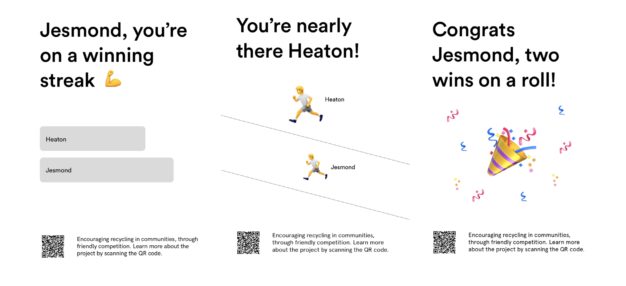
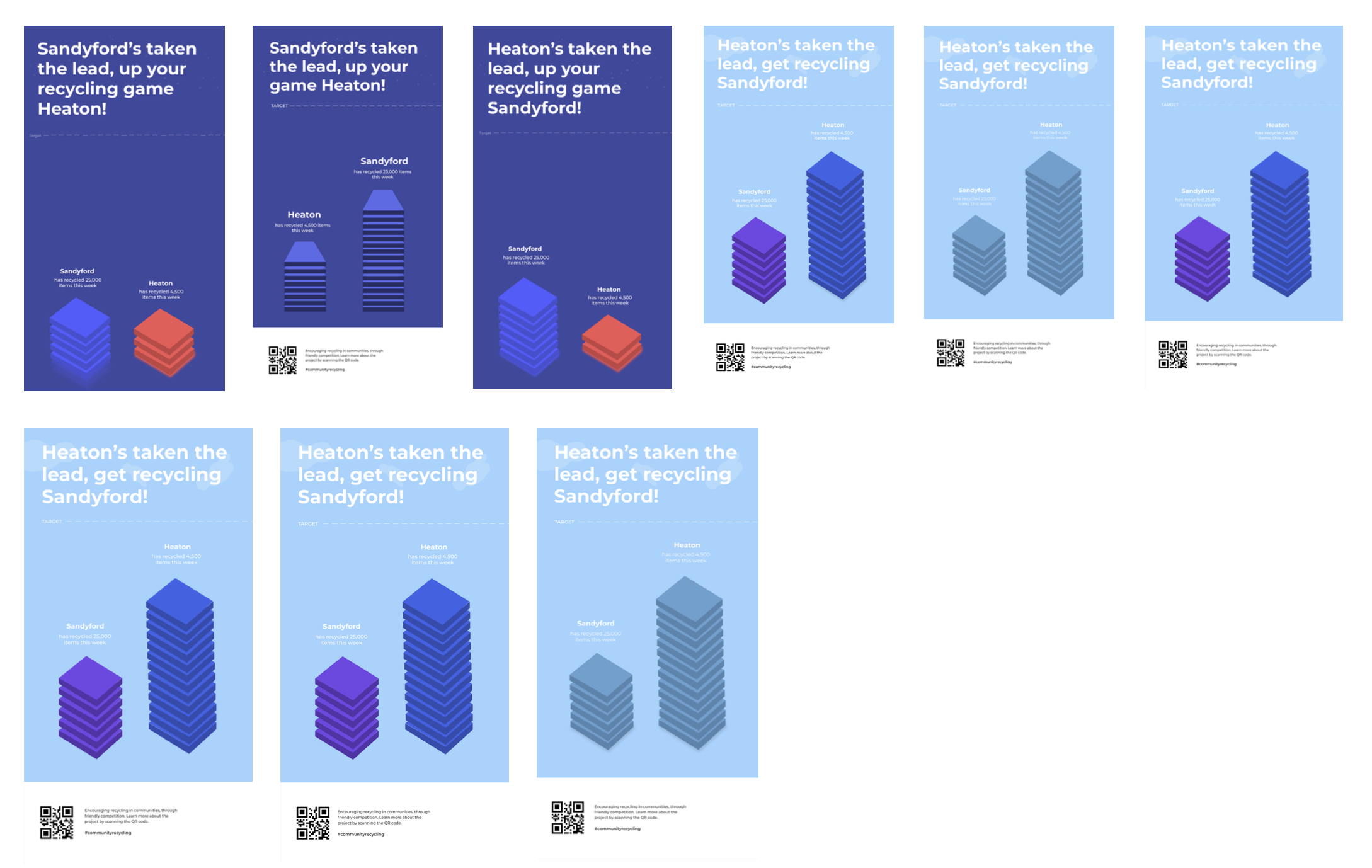
Our experimentations with a gamified interactive poster design led us to a ‘Tetris’ like concept, so when rubbish is added to the bin, a block would be added to that communities tower. We thought this idea had legs, and so we ran with it and started creating some ideas for that idea. You can see some posters below when we initially got this idea and started experimenting with it.
Our Final Proposal
Our proposal is - EKO, a recycling competition between two communities in Newcastle. We challenge the communities involved in the competition to reach a set recycling target (set by us) first.
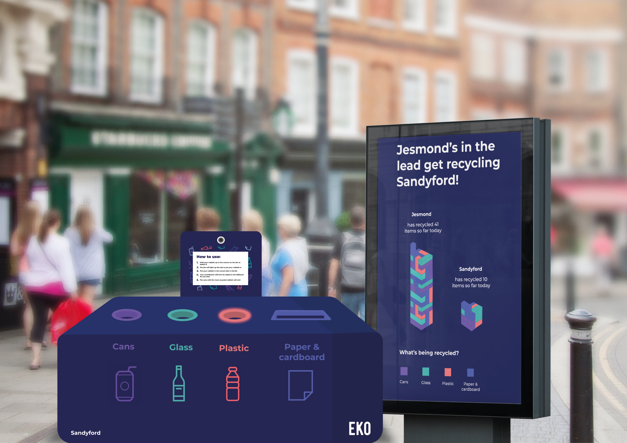
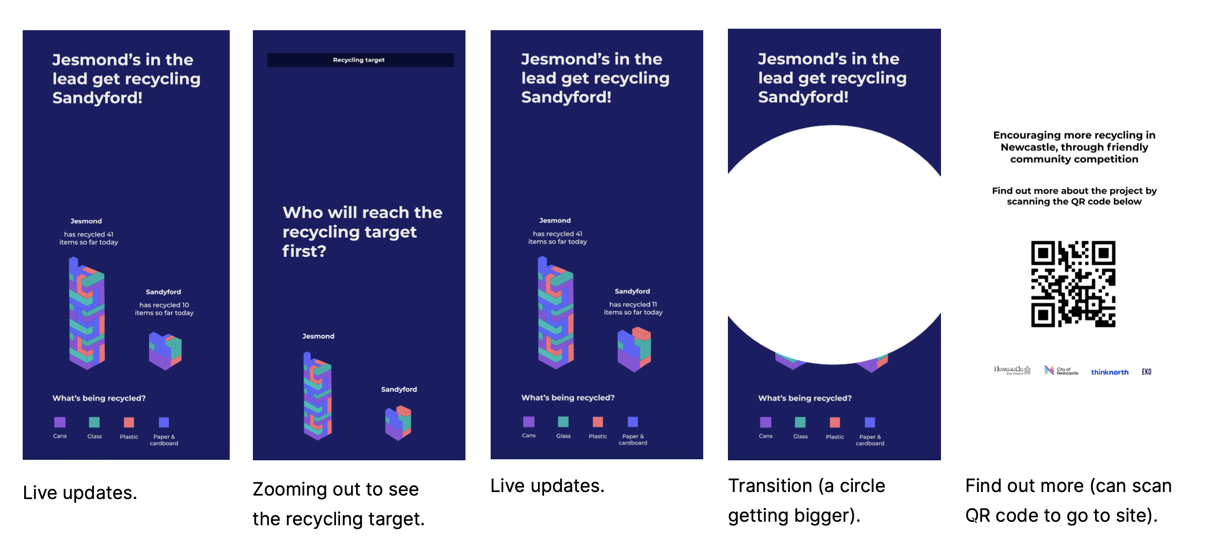
Every time a piece of rubbish is added to the correct slot in your local EKO bin, your contribution to your community is seen on our interactive poster next to our bins. On our interactive posters, we use towers to visualise which community is ahead in the competition, so every time a piece of rubbish is added, a block is added to your communities tower. The community whose tower reaches the recycling target first wins!
Bin and Interactive Poster mockup
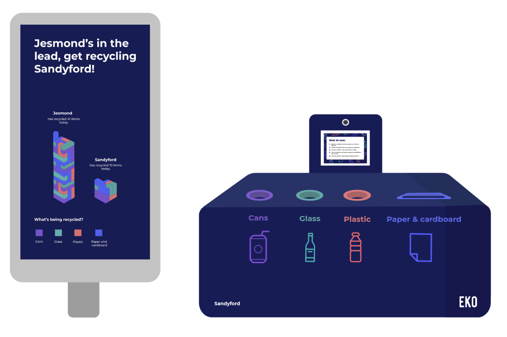
We created a bin and an interactive poster mock-up to see how they could look with the EKO branding and colour scheme.
For the bin mock-up, we decided on a rectangular shape with slightly curved edges as from our research we discovered people often prefer this shape with recycling multi-bins. Using our brand colour scheme we added our bin drop slots to the top of the bin. For the cans, glass and plastic we mutually agreed on cylindrical shapes. The paper and cardboard drop slot will be rectangular. We chose these shapes as they were influenced by the research, we found what the public preferred.
On the front of the bin, we included phrases with icons to support the phrases. We kept the icons large as they’re easily recognisable from a distance if someone had difficulty reading the phrases. From our research, we found that most people preferred phrases with icons on bins rather than one or the other.
EKO Bin Poster and sticker
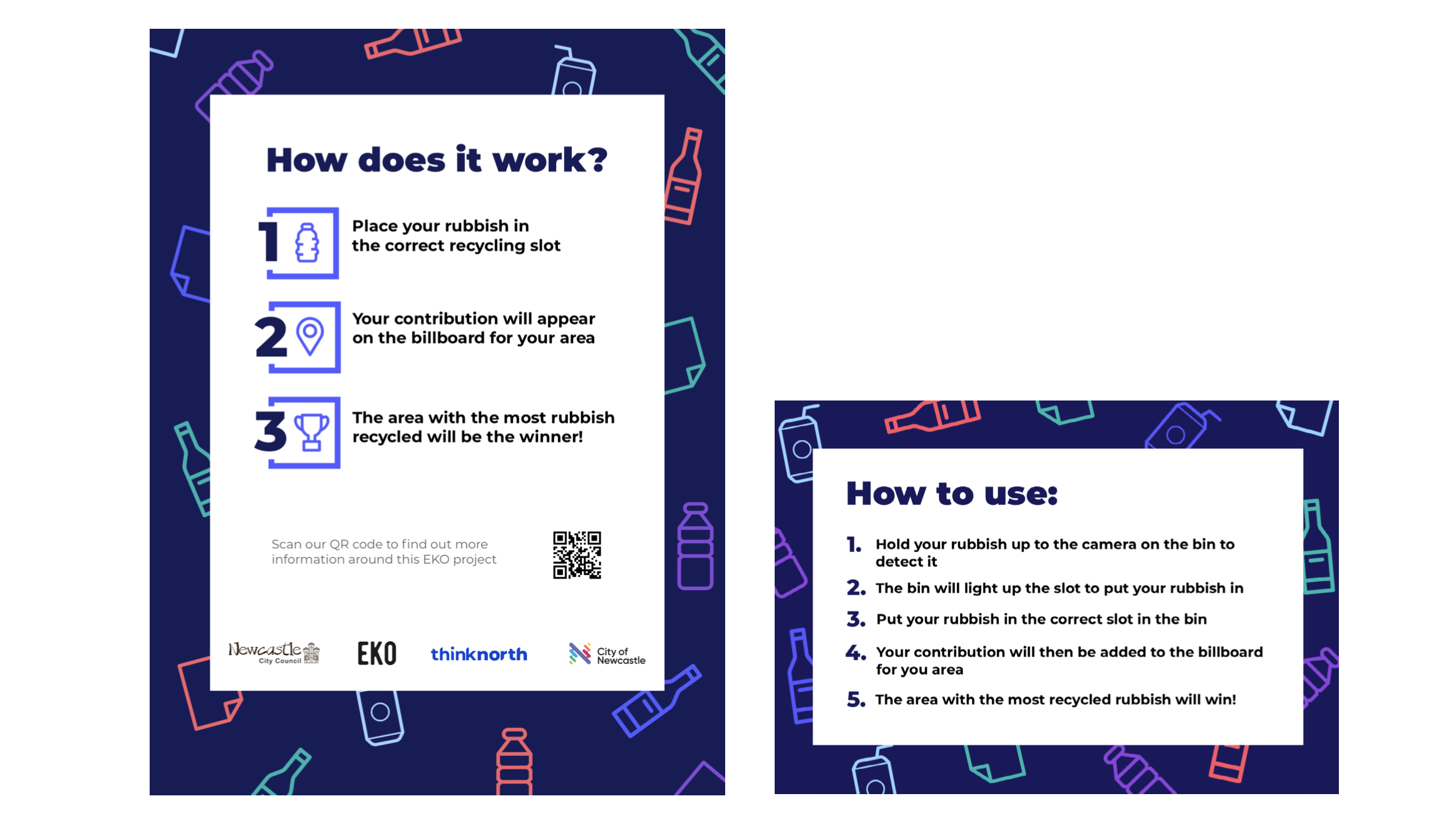
The poster that will go on the side of the bin will be to inform people about the project and how it works. This poster needed to be eye-catching, visual and simplistic at the same time. This was a challenge, but we started off by getting the general layout of the poster and then starting to add in the colour scheme of our brand.
Once we had the poster done, we created a smaller version (sticker) that would act as instructions at the front of the bin. This would be below the camera and allow people to know how to use the bin clearly.
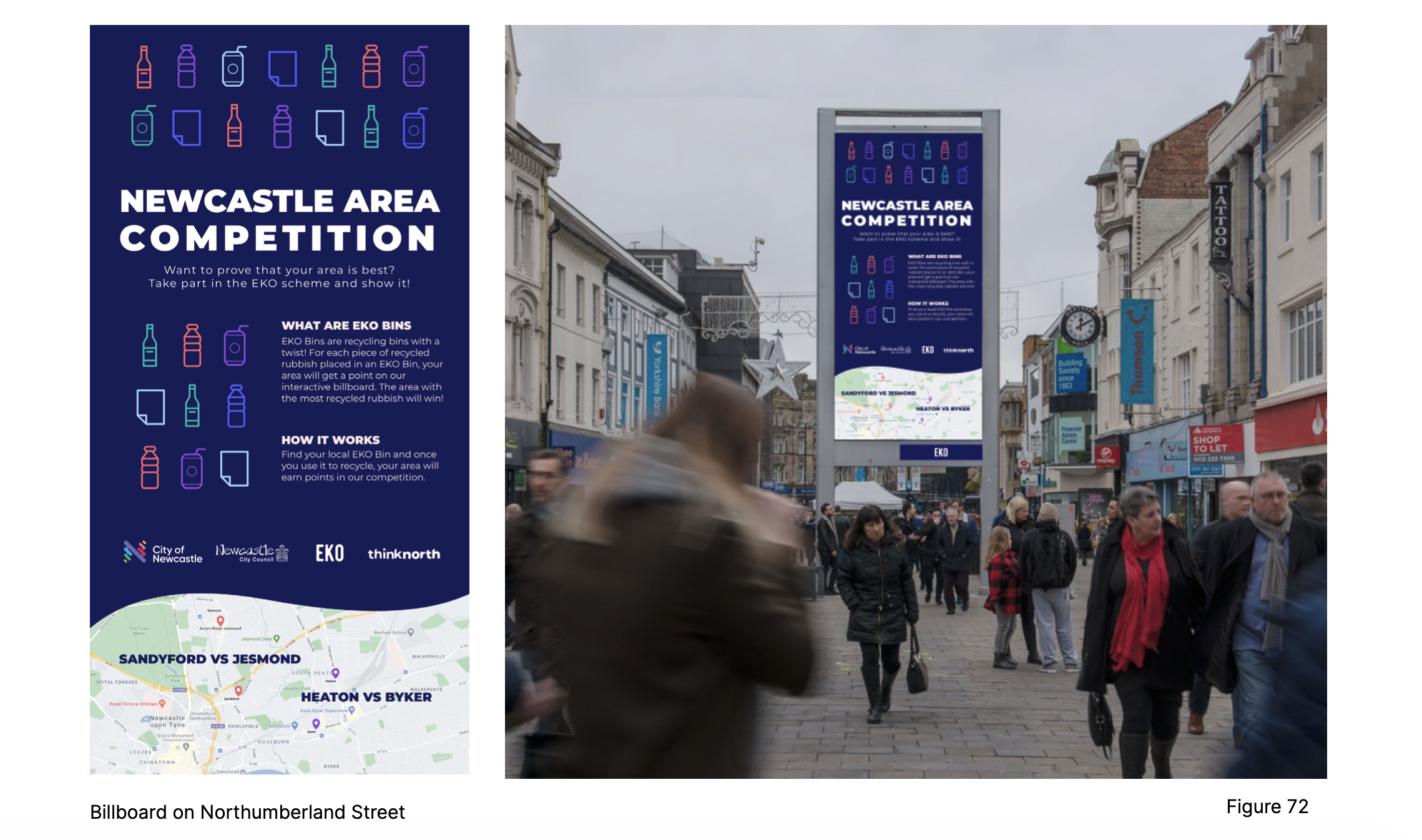
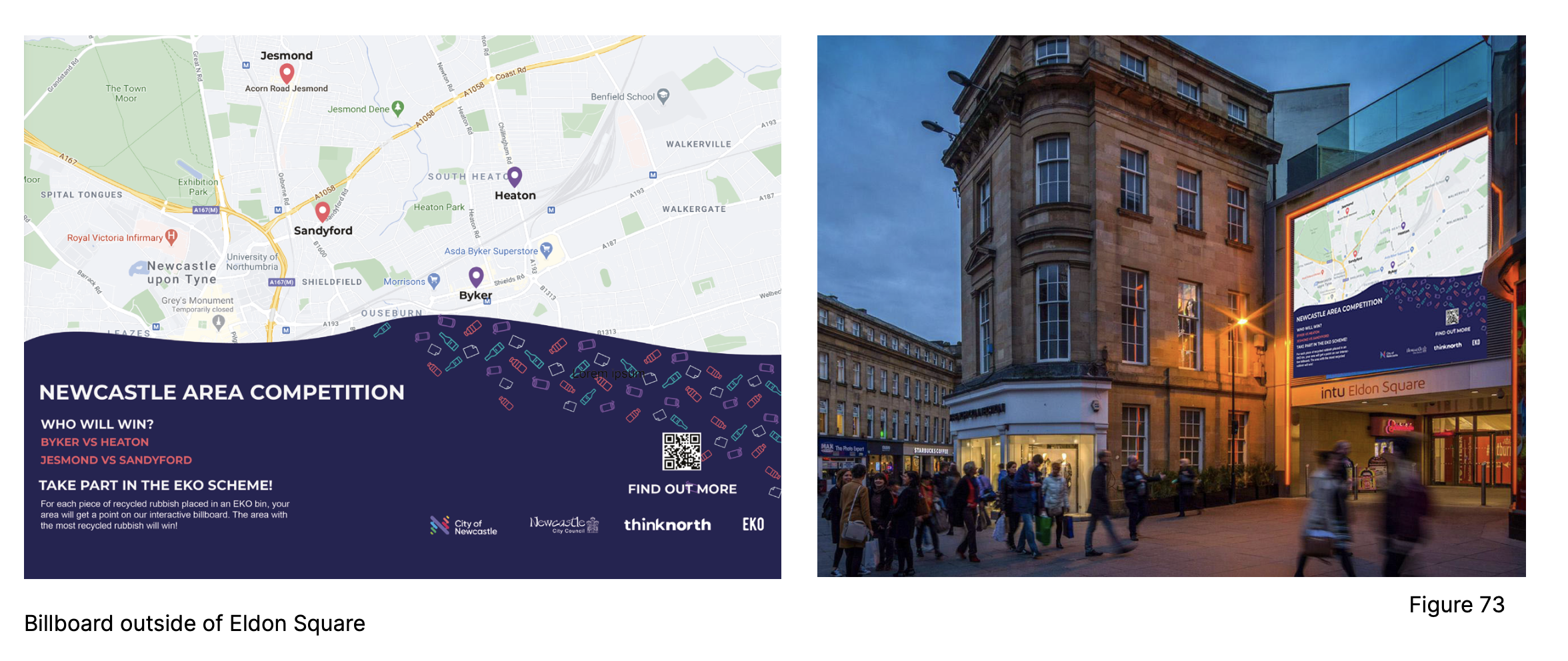
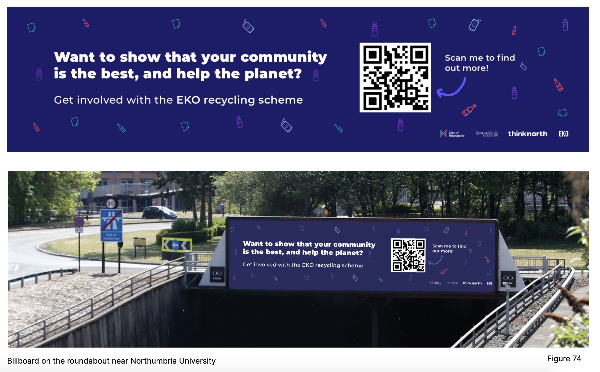
Billboard Advertising
To get the word out about our EKO scheme, we created some examples of billboards around central Newcastle. These will let people know about the scheme and where they can get involved.
Our Proposal Video
For our presentation back to the client, we created an animation of how our concept would work.
We were also able to include a technology section for the video which included all of the research we did around creating this product. Lastly, we also created a short prototype for this video which used a QR code attached to a water bottle to show how the AI software would recognise the rubbish and add a block to the interactive poster.
How we met the Design Brief
Our concept not only creates a positive change, encouraging people to be aware of the waste that they may usually throw in the bin and disregarding recycling. It encourages people to be aware of climate change by reminding them of a small act they can do to help out. It reminds people that they aren’t helpless in climate change and everyone can do their part. Recycling and composting are effective ways to decrease the generation of greenhouse gases, such as carbon dioxide and methane.
They achieve these benefits in two ways:
By helping save energy in the processing of materials for industrial and consumer use.
By reducing the flow of materials, especially food and other organic wastes into landfills where anaerobic decomposition produces methane.
Every time a new product is made from raw materials, large amounts of energy are consumed. We can think of the role energy plays in the four stages of product development - extraction of raw materials, the manufacture of these materials into products, product use by consumers and product disposal. In most cases, recycling uses less energy, which translates into fewer fossil fuels burned and reduced emissions of greenhouse gases that contribute to climate change.