Reach4Help Design Sprint
OVERVIEW
Project Brief
Reach4Help is a service that was set up in the middle of the COVID pandemic, it matches people who need supplies and are self-isolating with volunteers who will collect those items. Our task was to improve their website via a 2-week design sprint, which we would complete and present back to the team.
The Goal
To complete a 2-week design sprint. We would test their current website with users, iterate and design a new website that was based on user feedback.
The Team
I worked in an international team and the project was completed remotely. During this project, I worked as a UX Designer/Researcher.
Responsibilities
Qualitative Research, UX Design, UI Design, Content Design, Prototyping and Testing
Tools
Figma, InVision, Zoom, Notion, Google Forms, Slack
The Process
My process will be different in different projects and will be determined by many factors such as the project goals, business needs, complexity of the problem, time and etc. This project had a short timeline, so below I’ll describe the process for tackling this project.
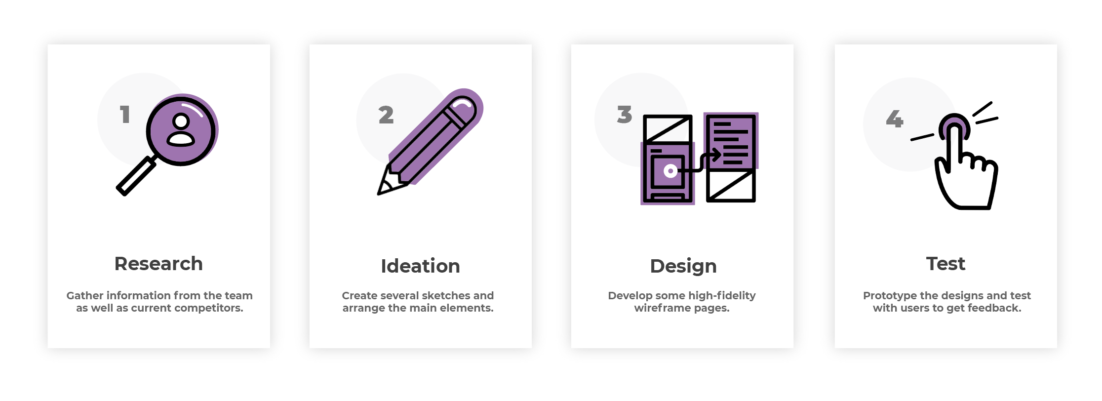
Discover
Understanding the core of the product
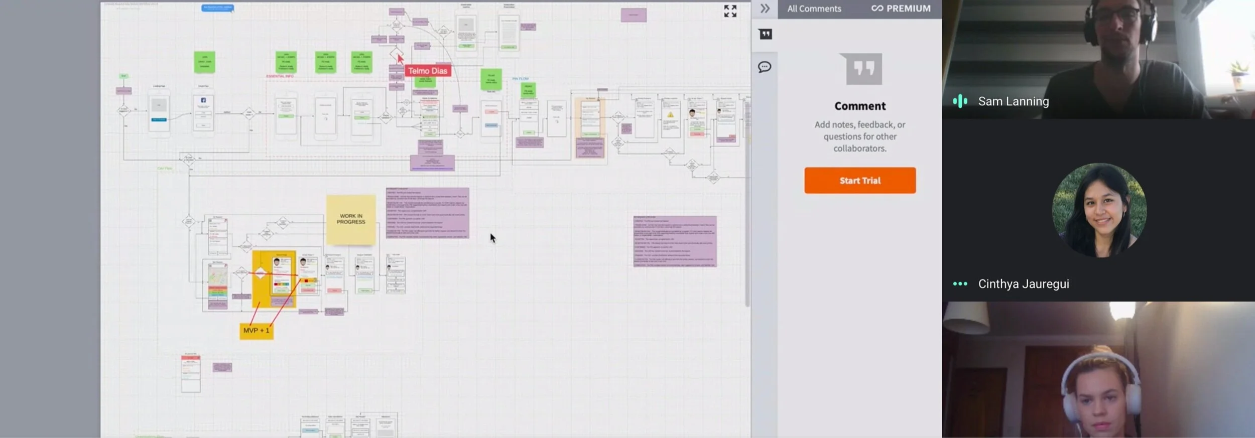
At the start of joining the project, I had an onboarding session by the UX Lead in which we were taken through the current user flow. I was able to gather information around their current progress and what they hoped to achieve. At this stage in the process, they had done virtually no user research and based design decisions purely on instinct.
I really wanted them to take a more user-centred approach to their designs, so I agreed to complete a 2-week design sprint in which we would conduct some research, create some new designs, test and then iterate based on feedback.
Identifying current service issues
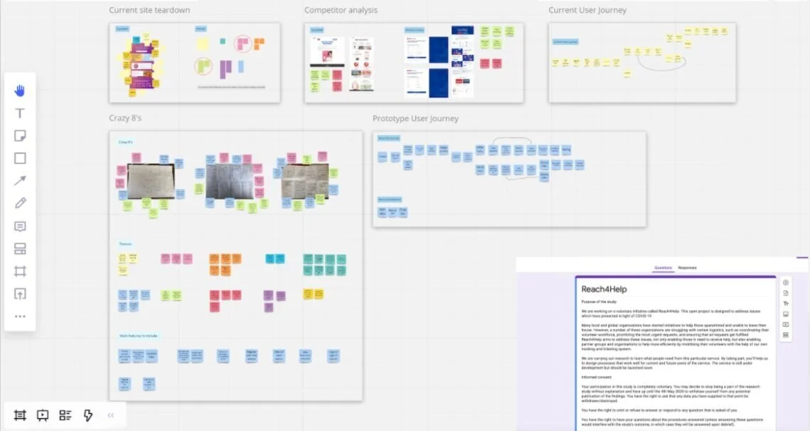
I was placed into a team with two other UX Designers and to start off the design sprint we wanted to get an idea around current issues on the website. We conducted a current site tear down in which we analysed their current designs and flagged potential issues or questions we had around their design choices.
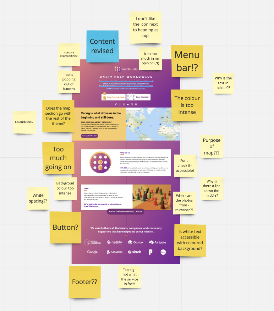
Key Findings
Accessibility issues - the majority of the text was either in colour or too small. This could lead to accessibility issues for those who have visual impairments or use a screen reader.
New information hierarchy needed - it is unclear what the main purpose of the site is and the information needs reordering.
New UI needed - the current UI is too colourful and elements such as buttons blend in with the background etc.
Needs site navigation - is is currently one long scrolling page, but breaking the page up and adding a menu would allow for an easier user experience in this case.
Ideation
Creating a user journey
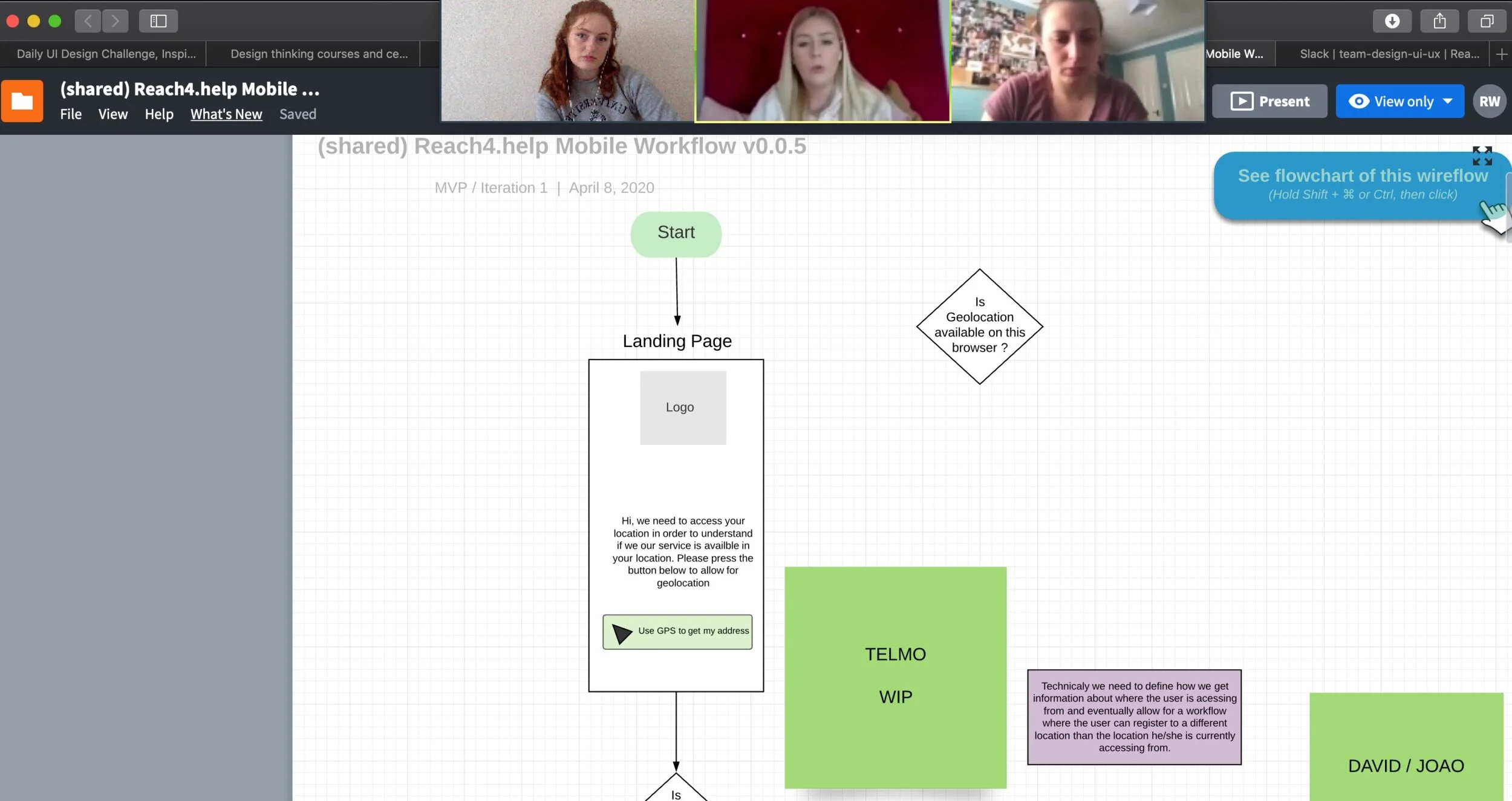
Once we had completed a site teardown, competitor analysis and released a survey, it was time to start gathering our ideas in the form of a user flow. This would be a basis for our wireframes and allow us to all share the same goal when designing.
Creating Low-Fidelity Wireframes
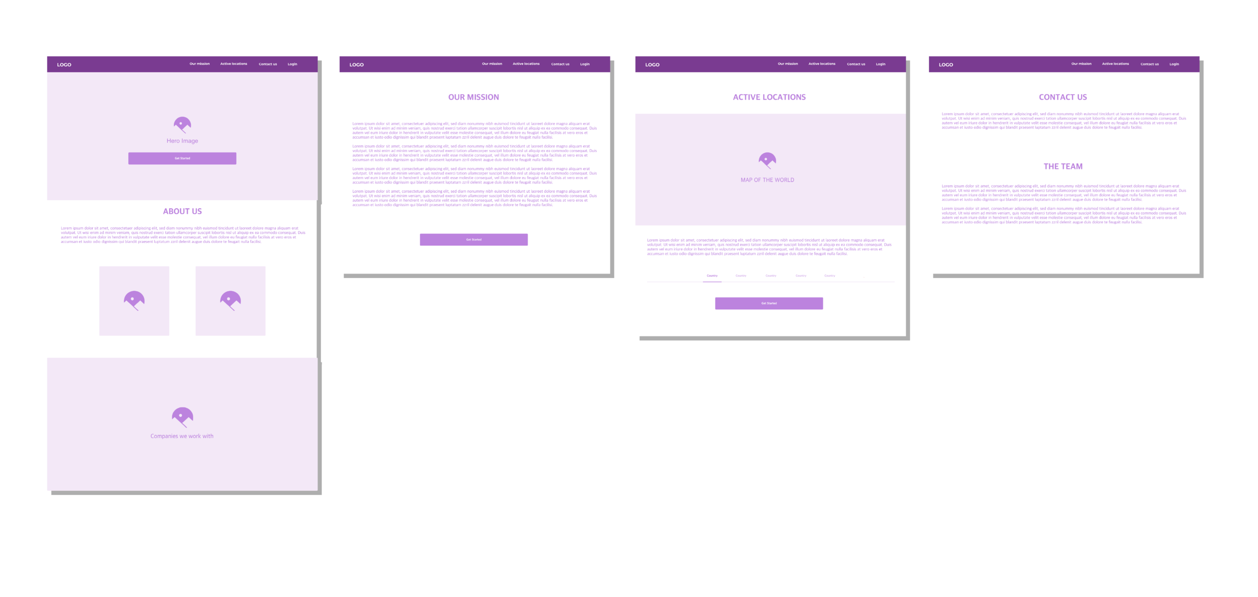
After the user journey, it was time to start creating some low-fidelity wireframes. These were to give us a basic idea of what the pages would look like using blocks and text fillers. Below are a few examples of the screens we created.
Design
Updating the branding
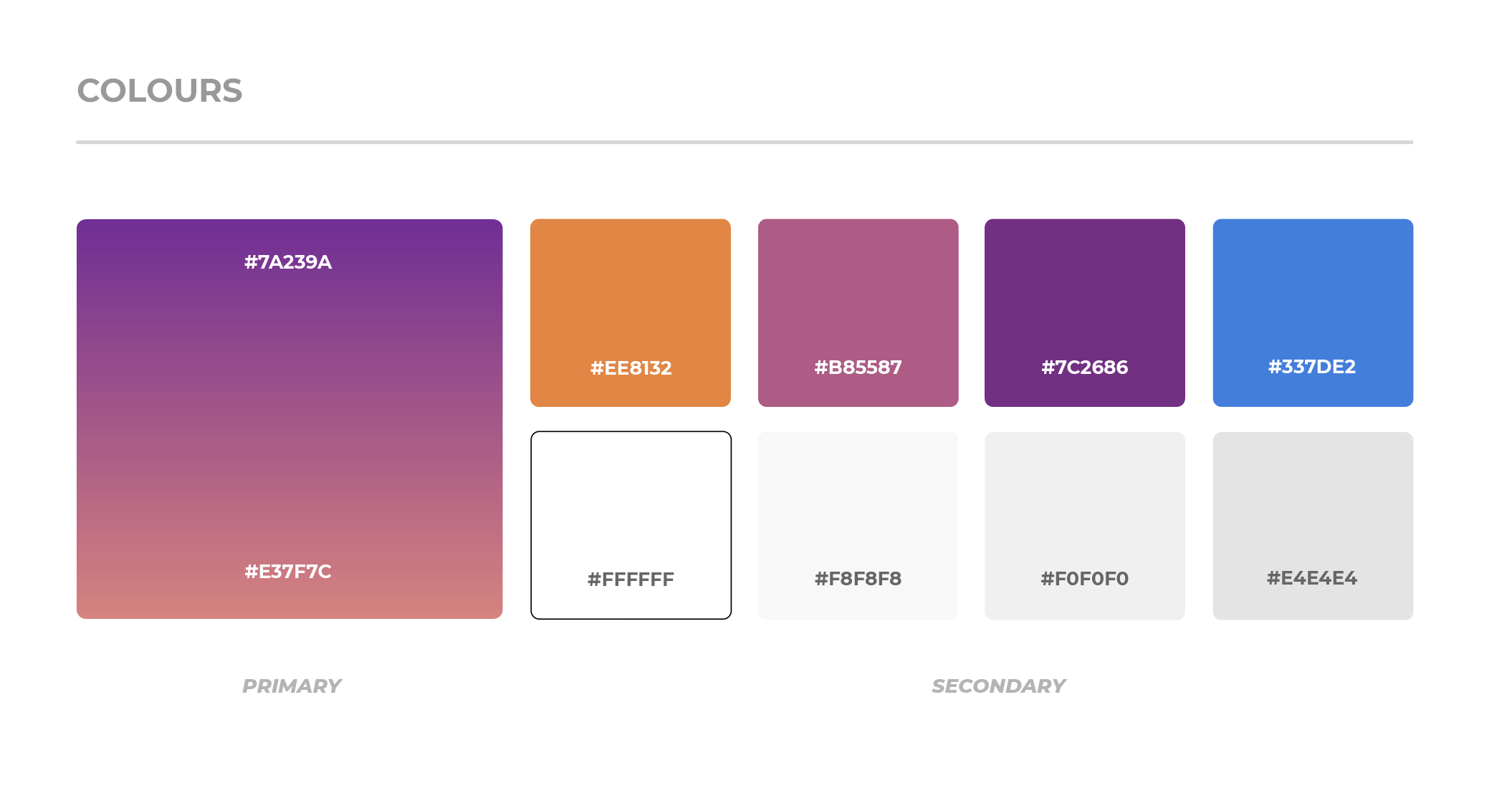
This is a style guide for Reach4Help's brand. This style guide contains the new colours that we used in our designs. We wanted to keep the same branding that they had created previously, however, in this new branding we added more white space to allow text to be read more easily.
Creating High-fidelity Wireframes
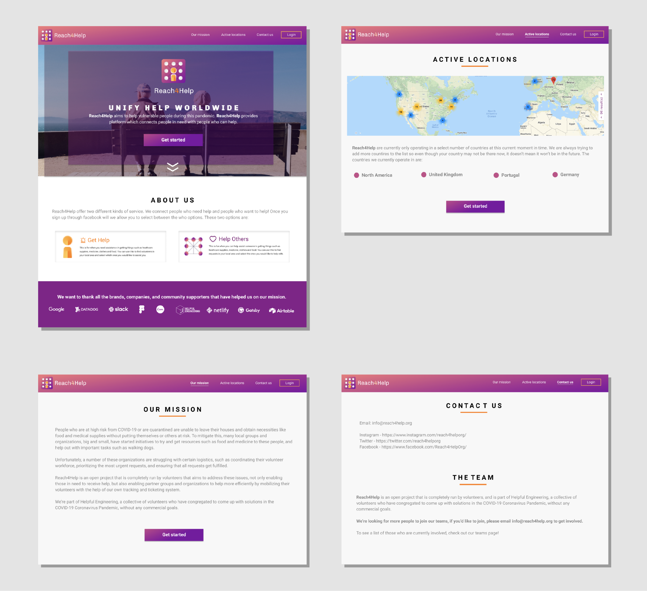
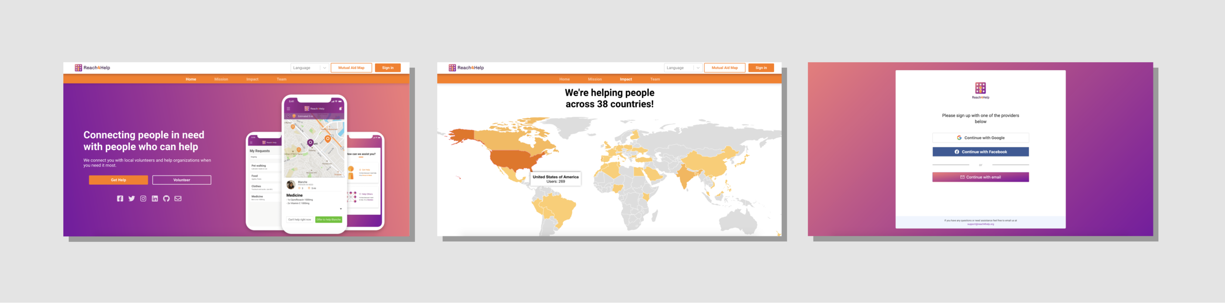
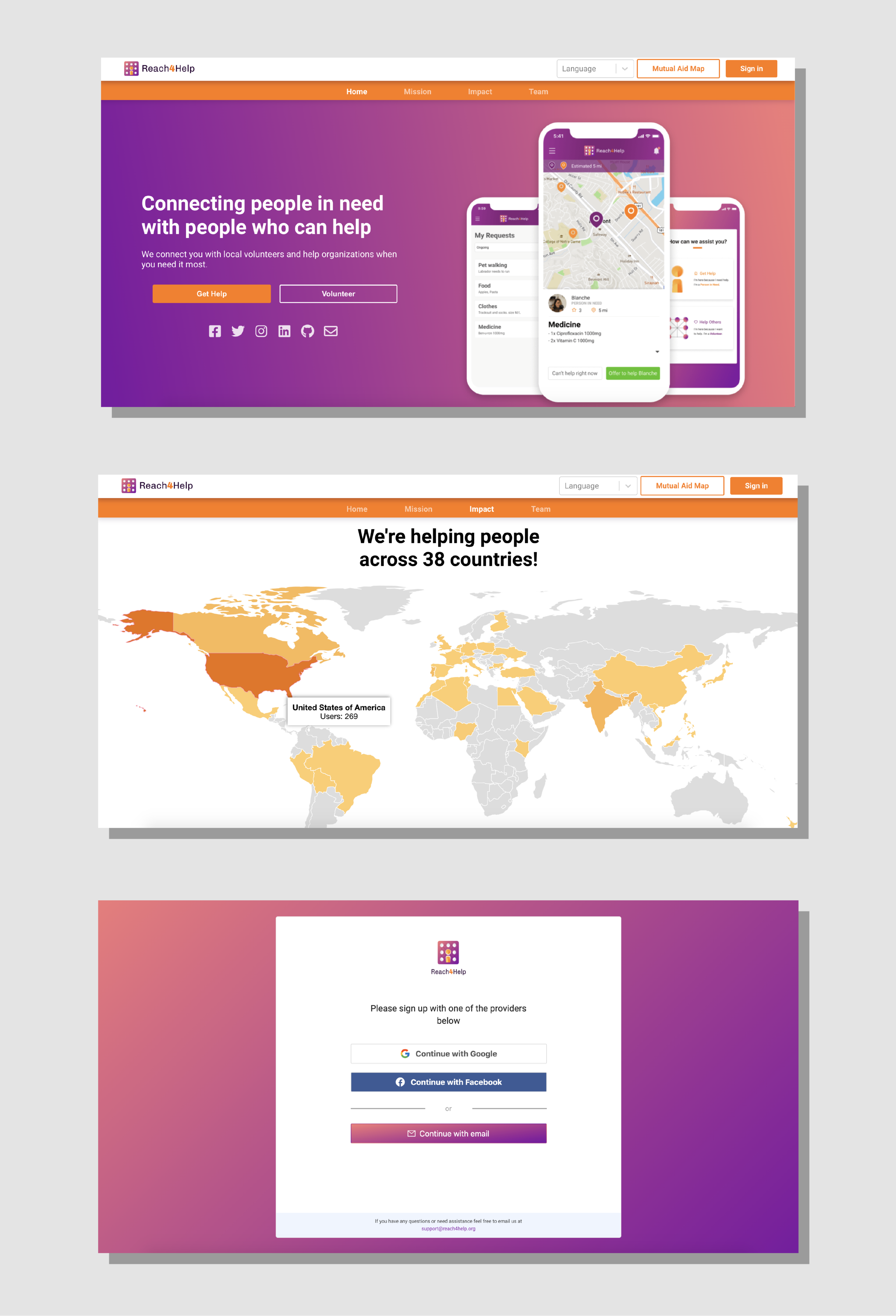
When the users start the app, they will be brought to the homepage, from there they have the option to start the signup journey or log in. They will also get the option to navigate to the Active locations page, the Mission page and the Contact us page.
Homepage — where users can get an idea about what Reach4Help is, as well as the different options on the service.
Active locations — where users go to see if Reach4Help is active in their own location.
Our Mission — where users go to find out more information around Reach4Help and their mission.
Contact us — where users go to contact Reach4Help or sign up to volunteer on the project.
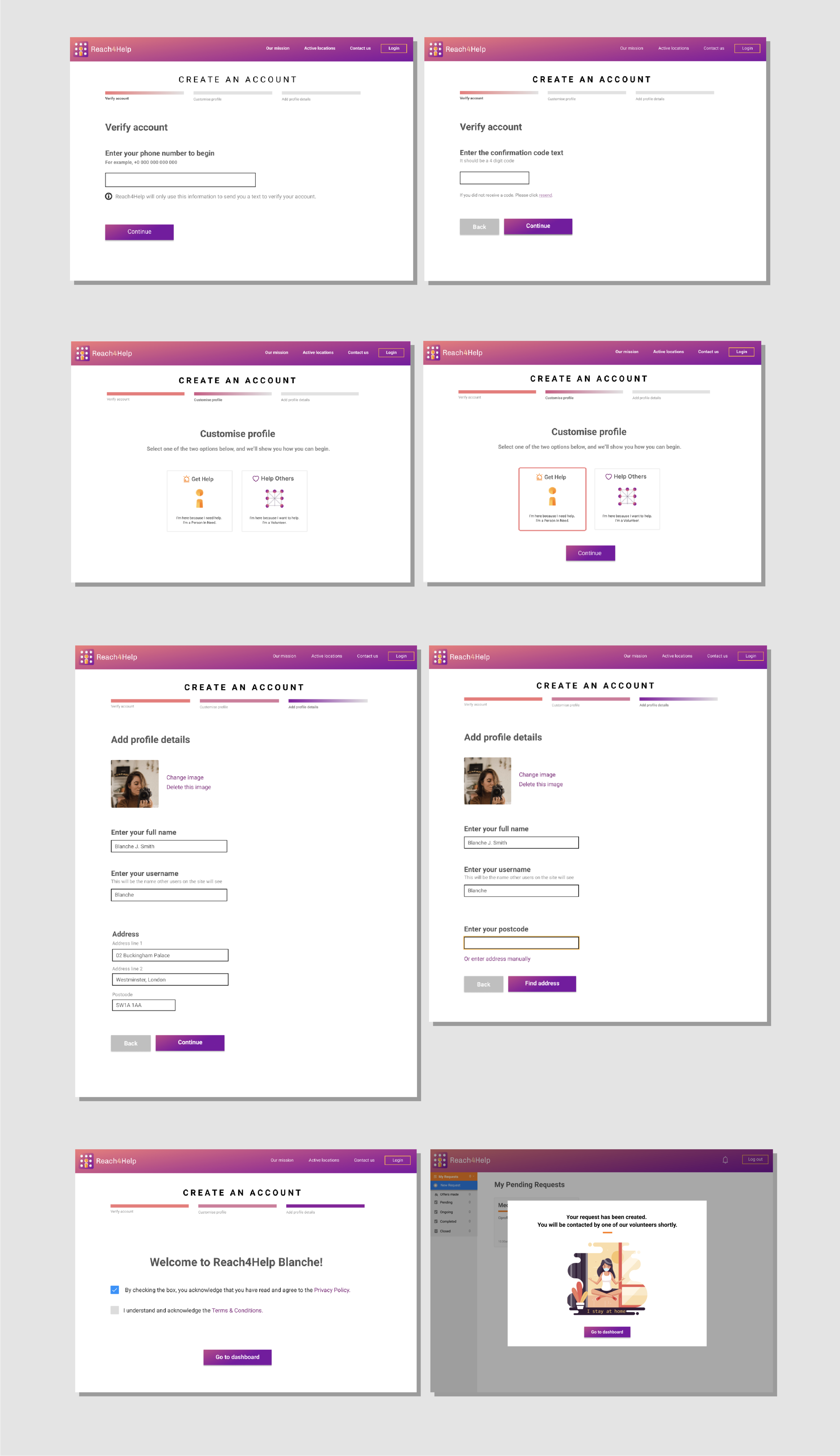
If the user decides to signup for the service they will need to complete the ‘get started’ journey. This journey takes them through verifying their phone number, entering their details and creating an account.
Verify account — where users need to give a phone number so that they can enter the code texted to them.
Customise profile — where users can select if they wish to be a volunteer or receive help.
Add profile details — where users can add a picture and enter their information that will help them use the service.
Account completion — where users will get a validation message that they have set up an account successfully.
Dashboard — where users can see their requests or make new ones.
Usability Testing
Figuring out what worked well and what didn’t
Now that we had completed our Hi-fi Wireframes, it was time to test them on users to validate design decisions and work out any other issues with the layout or journey. We tested on 4 people, updating and iterating our designs after each one based on the feedback given.
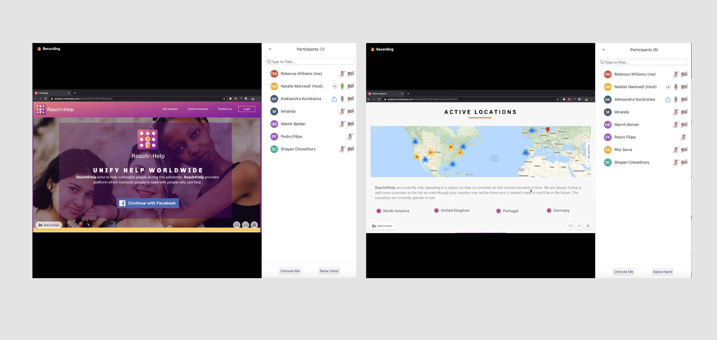
Our Final Recommendations
Based on our usability testing, we created a list of recommendations for the final designs that we presented back to Reach4Help.
Sign up journey is too long - the process of creating an account is too long-winded and could act as a potential blocker for users.
The team section is confusing - none of the participants realised that this was talking about those who had built the service. All participants thought this was how you asked to volunteer in the service. Potential volunteer blocker.
User safety concerns - volunteers need to be vetted properly.
Phone number reluctance - having the phone number verification first in the journey caused some of the participants to get uncomfortable.
Clearer contact information - make it clearer to users how they will be contacted by the volunteers.
Final Designs
Concluding our design sprint
To finish our design sprint we worked with the rest of the UX/UR team to make the recommended changes to their website. The website is now live and in use in over 37 countries. Below are a few examples of screens that I designed which made it onto the current live version of the site.
Project Learning
What I have learned from this project?
Fight for what you believe in. As a junior UX Designer, this was the first project in which I alone had to push for user-centred design. The team was mostly developers who wanted to get the service out as quickly as possible, I had to negotiate with them and the team to allow time for research/usability testing. It was a brilliant learning experience as I was able to demonstrate the importance of UX/UR very effectively.
Keep doing different tests and validating the ideas before launching any features. Defining a proper measurement for success is one of the keys to validate the test results.