HMCTS Adoption Service
OVERVIEW
Project Brief
The UK’s Adoption service is a legal procedure in which the parental responsibility for a child is transferred from their birth parent to their adoptive parent. This service was a part of the HMCTS reform programme; this aimed to modernise the justice system. Our task was to digitally transform the UK’s Adoption service from a paper-based and hassled-filled task to one that works better for everyone involved.
The Goal
The main goal of this project was to make the UK’s Adoption service safer, quicker and easier. Success for this project would be a quicker application process (currently takes 37 days to complete), fewer applications returned due to errors (30% are returned on average) and having the ‘Annex A’ document received by the courts at the same time as the Adoption application.
The Team
I worked in a cross-functional team. As a UX designer, I was involved in all phases of the project, from mapping out the problem to delivering final designs.
Responsibilities
Qualitative Research, UX Design, Content Design, Prototyping and Testing
Tools
Miro, Slack, Trello, Sketch, Gov Prototyping kit
View our full design process: Adoption alpha document
The Process
My process will be different in different projects and will be determined by many factors such as the project goals, business needs, complexity of the problem, time and etc. This project had already had a discovery phase with a different team, so below I’ll describe the process for tackling this project.
Discover
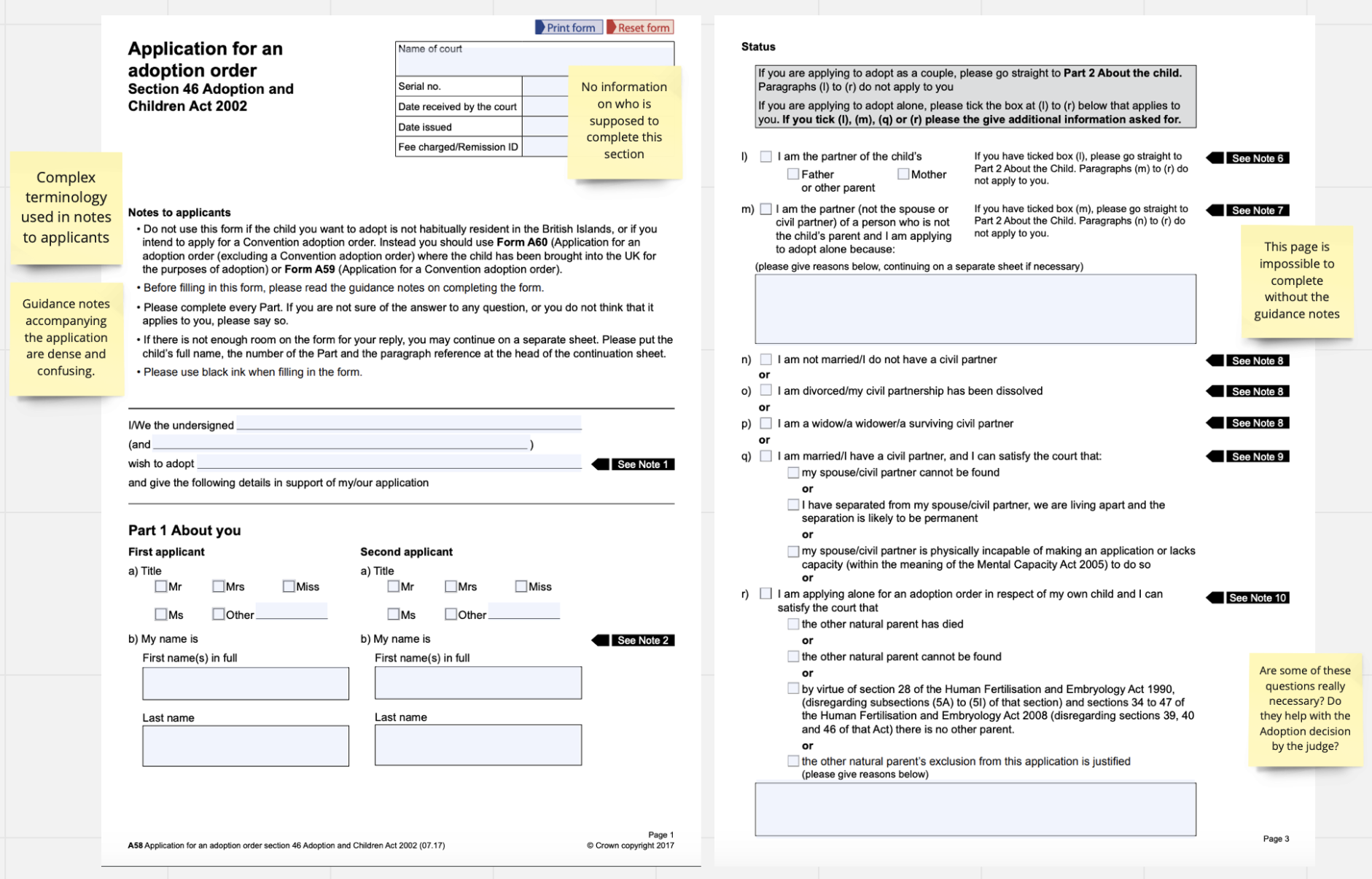
To start the process of creating the new digital Adoption Application, we first had to look at the current Adoption Application. This was paper-based and had to be physically sent to the courts via the post. This alone could be something we could improve by making it digital, but we wanted to take a deep dive into the form itself to see what we could improve.
Straight away there was a lot of complex questions and the need for a separate guidance form so you could decode what the form was asking. Looking at this was very useful as it already gave us an idea for a starting point before we conducted any user research.
Research
DEFINE THE USER
Understanding the Why with User Research
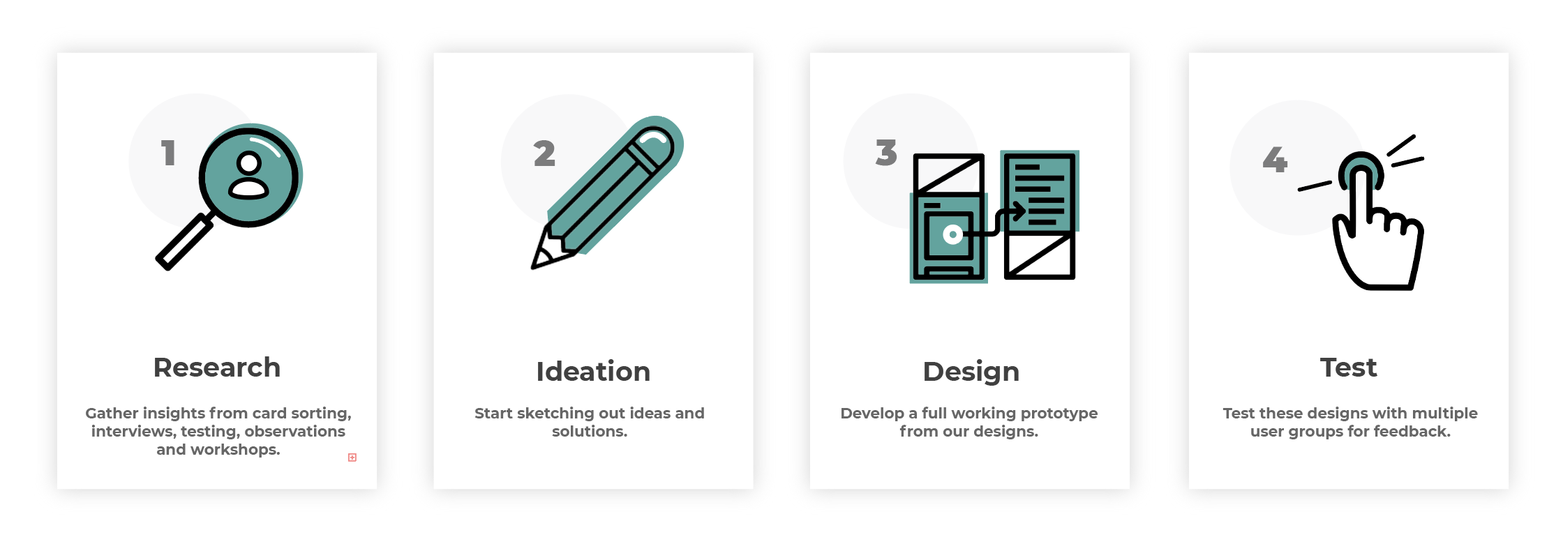
We used a number of different research techniques to gather information, these included: card sorting, 1:1 interviews, prototype testing, contextual inquiries (semi-structured interview), observation in the Courts and design workshops.
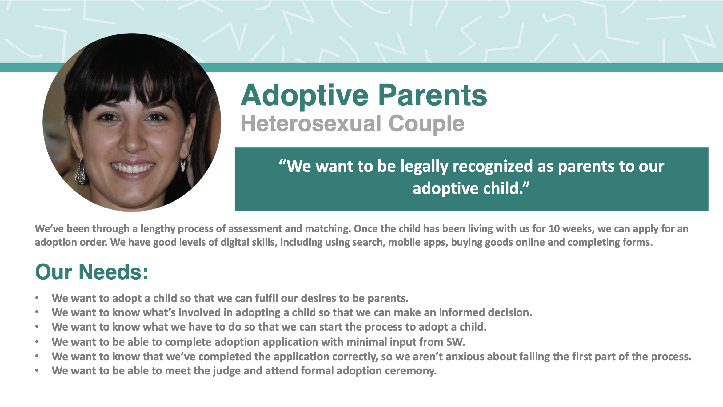
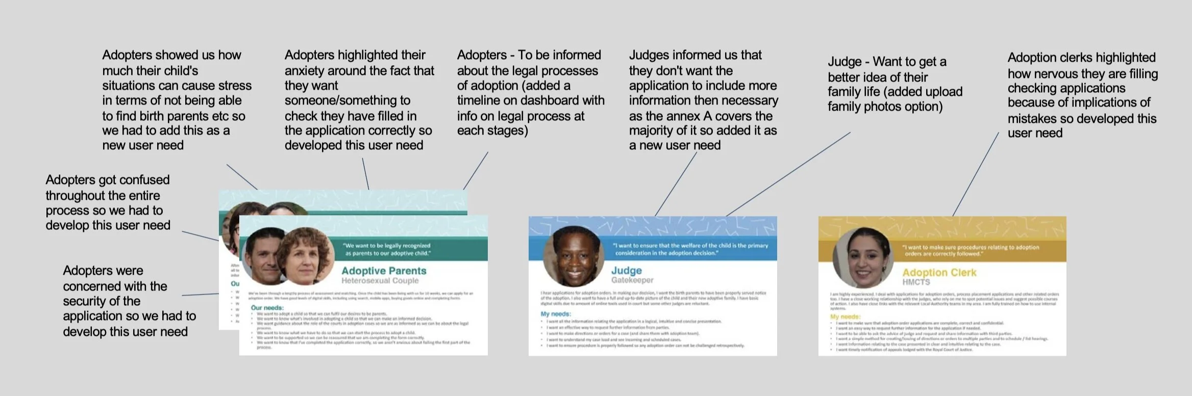
Using the information gathered we were able to create some personas with needs/pain points for each user group. This would help us validate any solutions before we started the design process.
Identifying current service issues
With our continuous research throughout this project, we iterated and evolved the personas. These iterations were based on interviews, workshops and observation sessions. We changed existing user needs, strengthened others and added new needs. Some examples of these changes are shown below.
Key Findings
Adoptive parents are motivated to apply - could we allow the users to fill out the form before their 10-week eligibility date but not click send?
The application takes time to complete - it needs to be passed around to different people. Digitally could we make this easier/quicker?
It's not always clear what’s required - the current form is very complex. Could we cut down the information required and simplify it?
Applicants are unsure what’s happening - could we create a dashboard feature for users to track their applications?
Applicants want to know... - could we have information on the application that specifically relates to the user?
Ideation
Creating an Adoption Journey Map
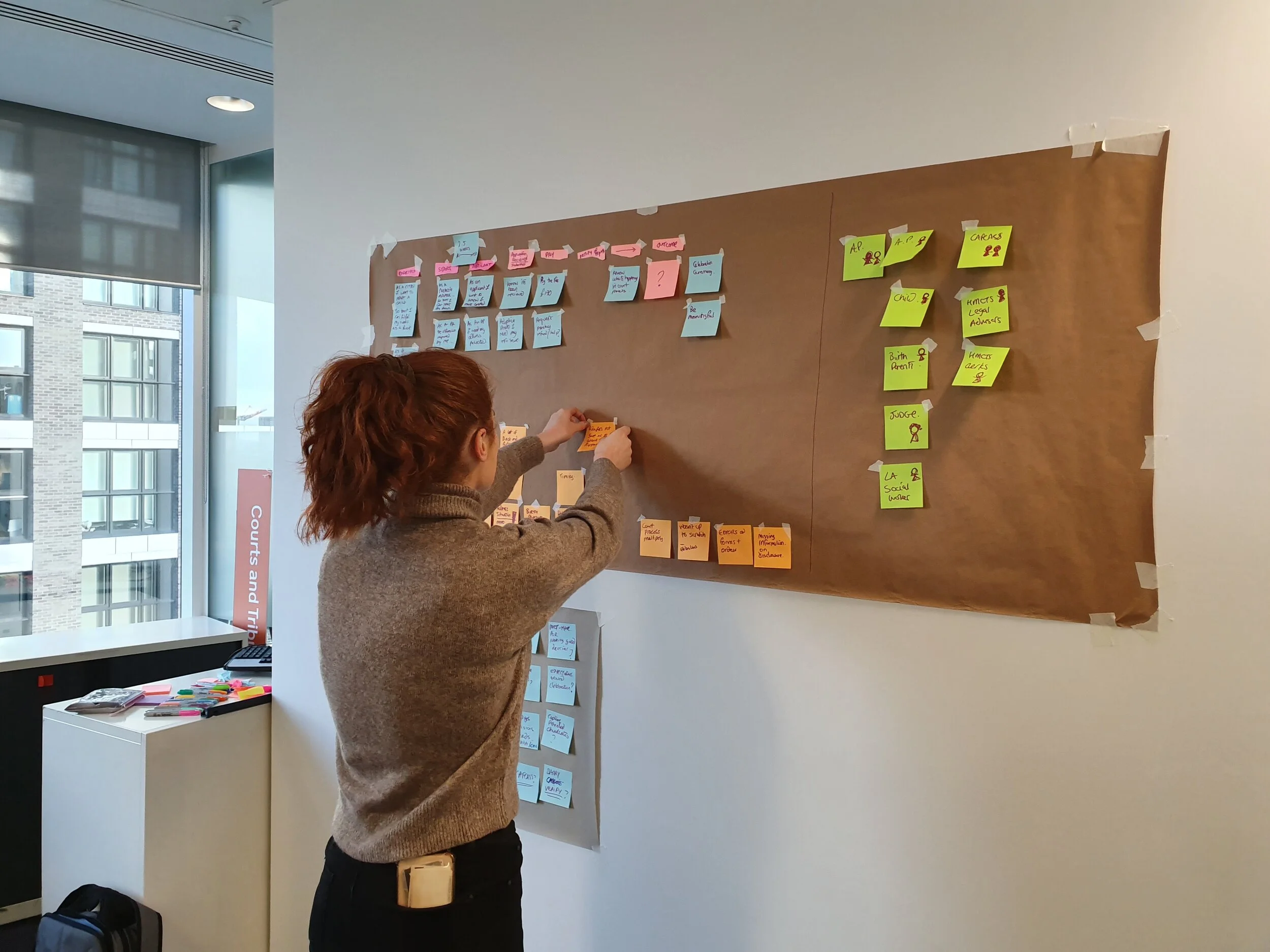
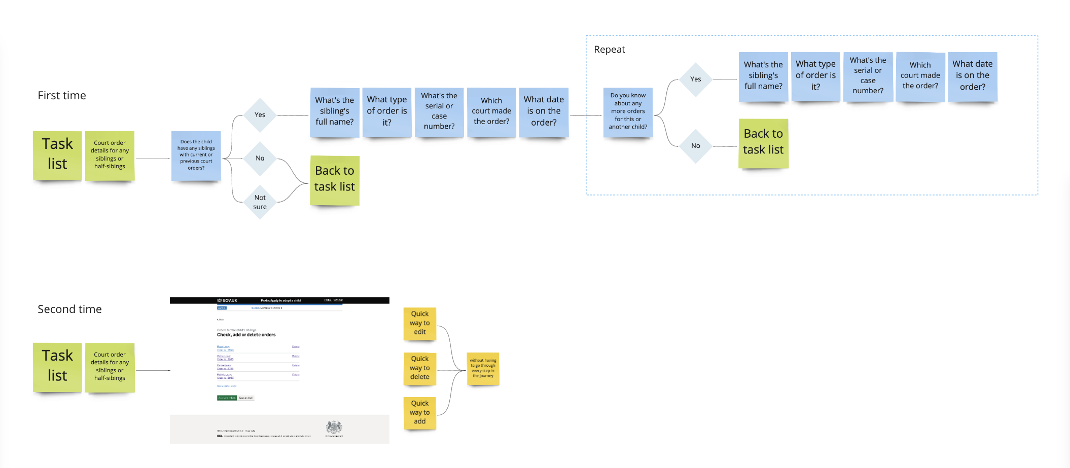
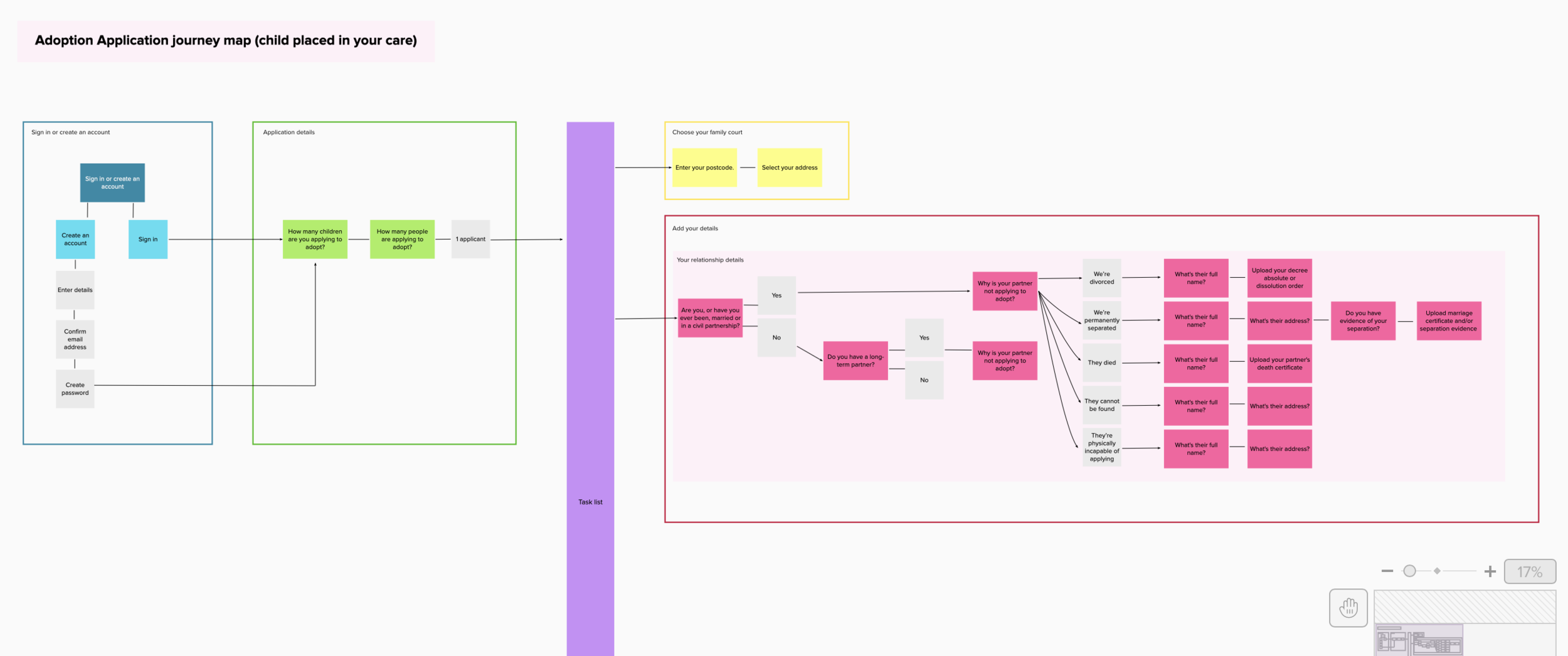
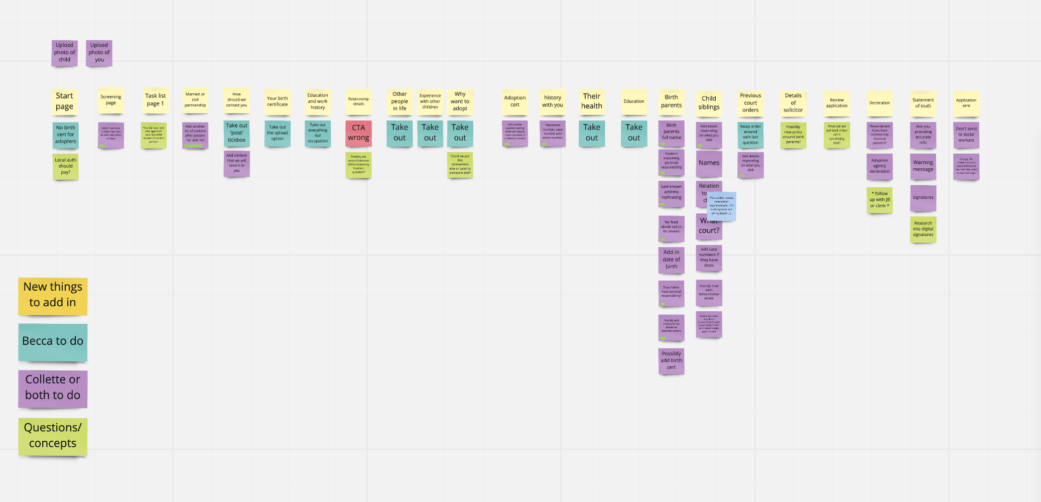
Once we had all of our research sessions and knew the current Adoption process like the back of our hand, I started creating a journey map for what the website could look like. This would help us organise what pages needed to be created and who could work on what task.
Below are some examples of the first journey map that I created using post-it notes, and then a more detailed journey map followed.
Creating the Prototype
To start our ideation process of getting screens down we used the GOV.UK prototype kit because it:
reduces effort and ensures consistency with GOV.UK – tried and tested patterns are ready to use
makes collaboration easy – the interaction and content designers could try then compare ideas
makes sharing easy – hosting the prototype on Heroku means we can share with all the team and wider stakeholders
looks 'real' – usability testing with prototypes can give greater insight
is a great way to show how the service progressed through sprints
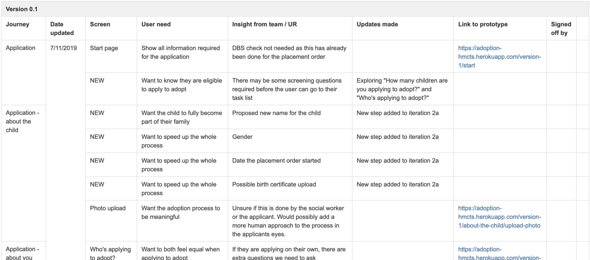
Creating a Prototype change-log
From the very start, we started tracking changes and updates to the prototype. These were the changes made after we tested with users and stakeholders. For each item we noted the: user need, insight learnt, and change made.
Team collaboration through Miro
Team collaboration through Miro (real-time board) allowed the team to:
view the end to end journey, review, add comments, ideas and thoughts
add direct user feedback to screens
analyse feedback together
decide how to solve users' problems together
make sure everyone's voice was heard
Usability Testing
Testing our Prototype at each iteration
To test our prototype at each stage, we met with different users (from different user groups) and had them try to complete tasks. These tasks were as general as “apply to adopt a child” to “where would you put your social worker’s information”.
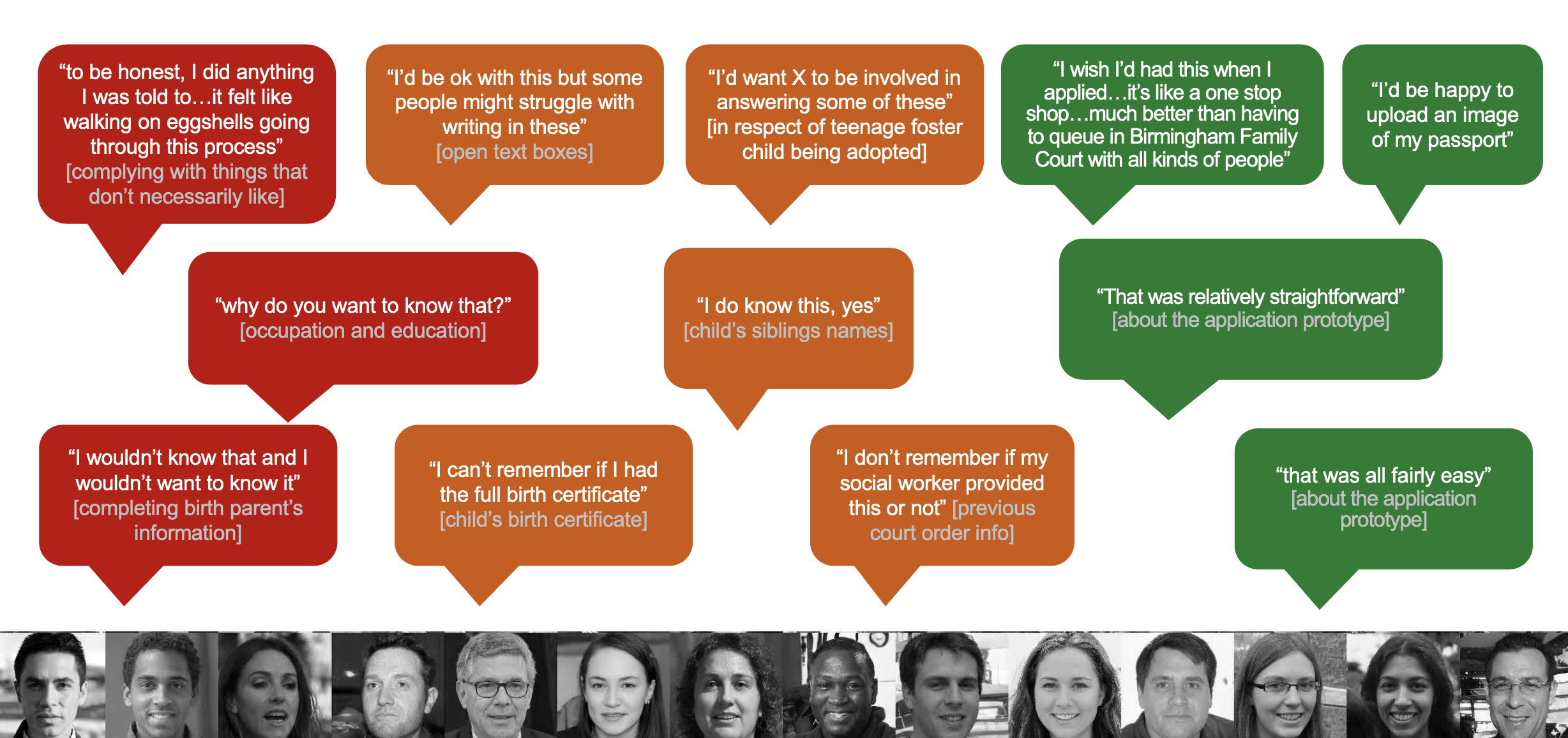
These test’s provided us with a great insight into what the users found confusing or that they didn’t understand, this was particularly important because there was so much legal jargon that needed to be included so we wanted to make sure that the users understood everything clearly.
Below are some quotes from users during our testing sessions.
Final Designs
The Digitalised Adoption service
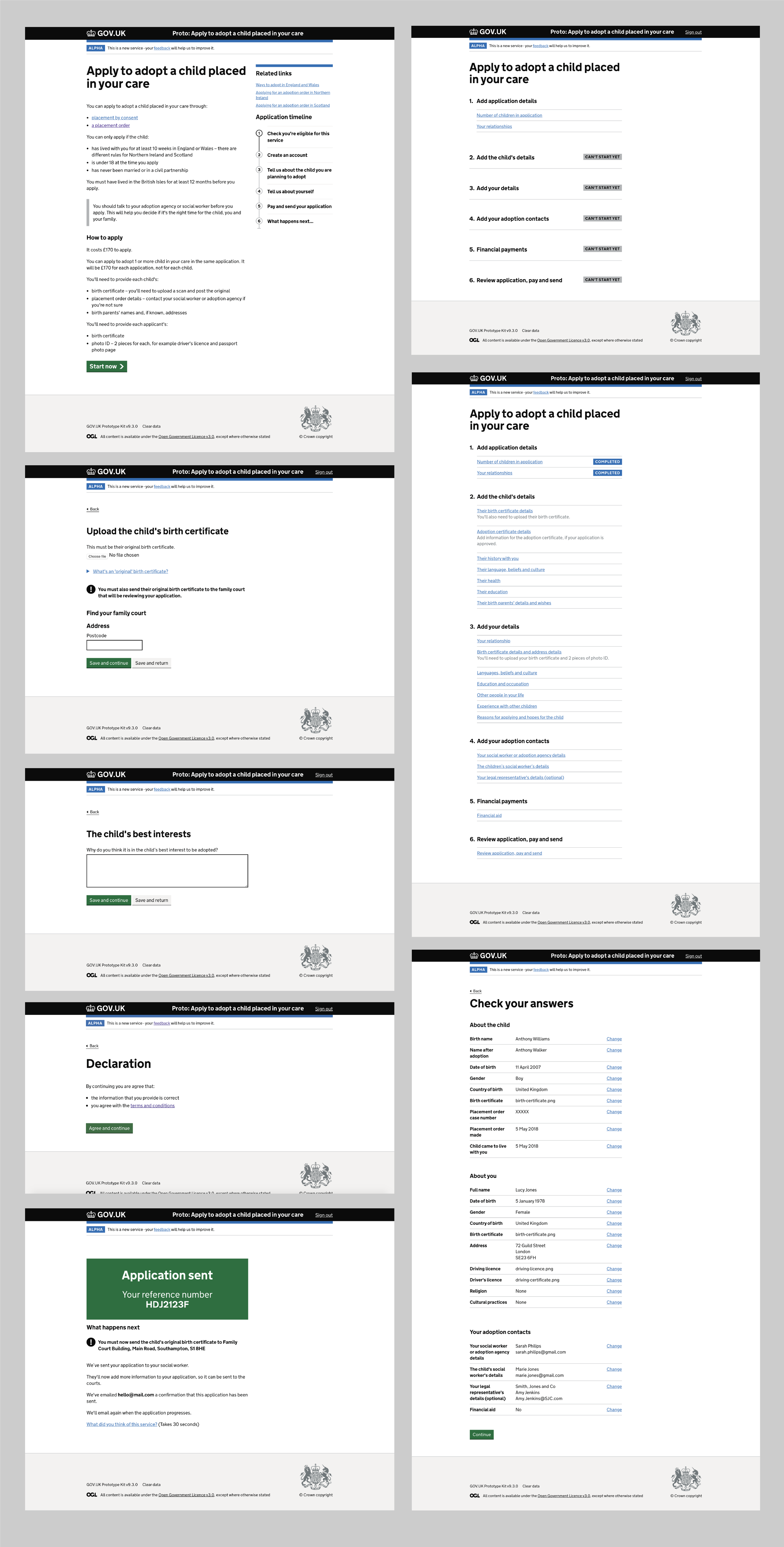
Overall, we evolved and iterated the prototype 14 times over the alpha, with up to three iterations in one week. These were iterated based on each usability testing session with multiple different user groups. As this was just the Alpha phase coming to a close, there was still a lot more to discover as the website would go live as a public beta. But here is a selection of key screens from the end of our Alpha stage shown as examples below.
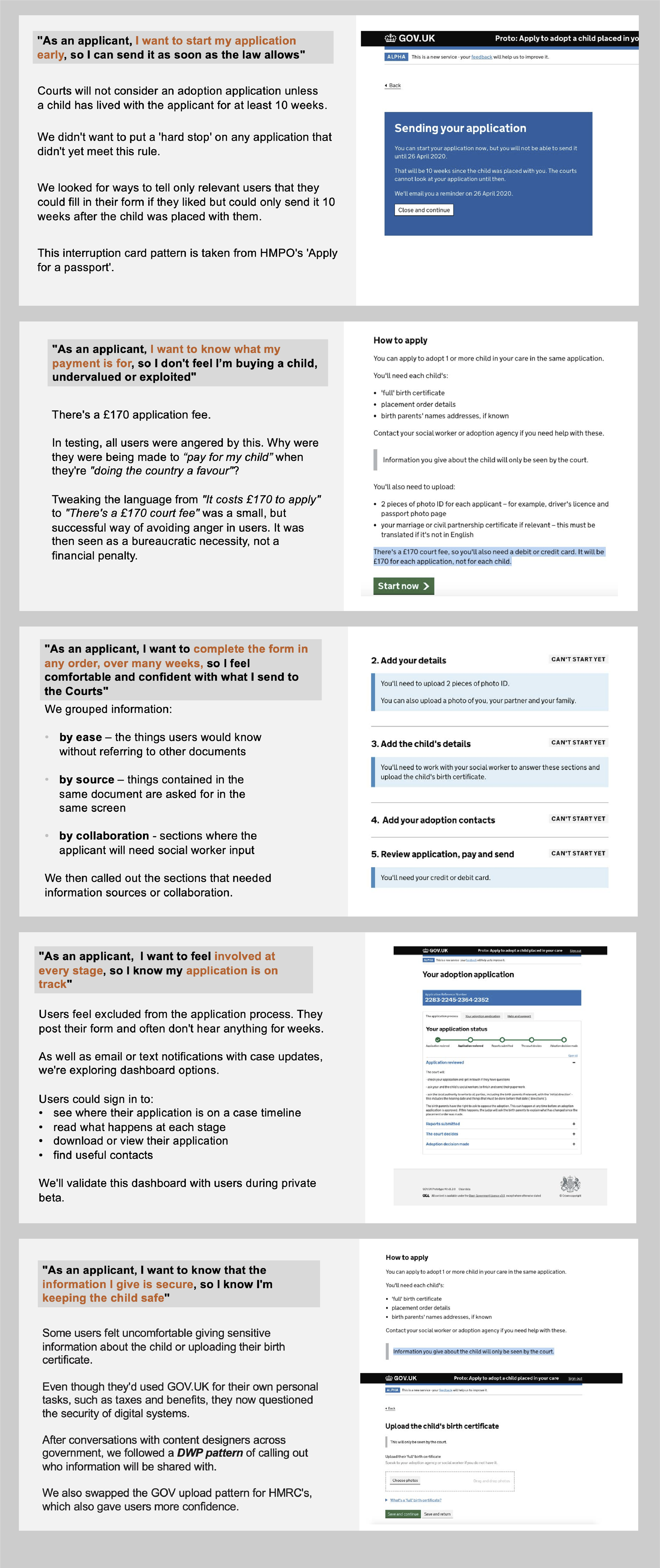
Why did we make design decisions?
We made design decisions based purely based on our research or current government design patterns. Below are a few examples of the design decisions that we made and the thought process behind them.
Project Learning
What I have learned from this project?
Always look back to the user. When designing a service that currently doesn’t exist digitally, it is very important to take into account what your particular user group would need and why. This is a brilliant opportunity to create something that is so much more efficient and user-focused than the current service, so your users need to guide your decisions fully.
Log your design iterations. Before starting on this project I hadn’t considered logging design changes, but now I see that it’s a fantastic tool to show others your progress as well as the reasoning behind each decision (so there is no confusion and less time wasted).